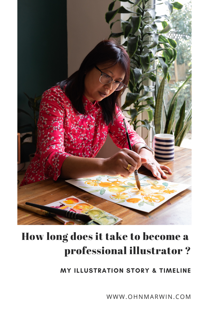
How long does it take to get going as a professional illustrator? Well, in my case, 25 years! The first ‘phase’ starting after graduating and then second ‘phase’ starting after a 8 year hiatus to bring up my two kids.
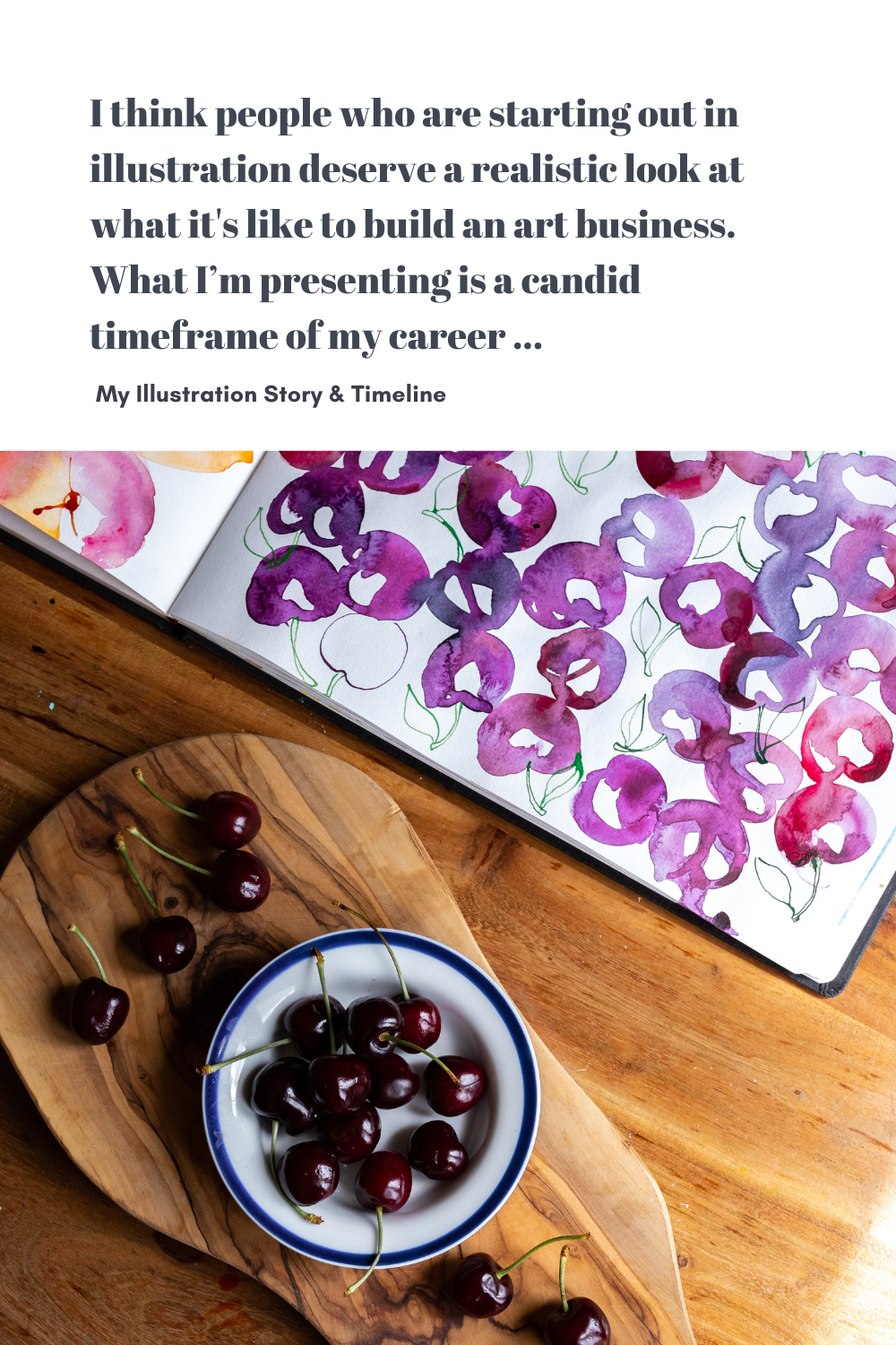
Honesty is really important to me and having been in the industry for over two decades I have ample experience to draw from. I think people who are starting out in illustration or contemplating it as a career deserve a realistic look at what it's like to build an art business. What I’m presenting is a candid timeframe of my career from my humble life as stay at home mum to the successful illustrator you see today. It’s taken considerable time and resources and I’m certainly not an overnight success story.
Some of you may have taken my Transition into Illustration Skillshare class or have followed me on Instagram for a number of years, so you may know parts of this story. I thought it would be valuable for you to see my journey laid out like the diagram below. This is just a quick overview of my particular journey to demonstrate the main events. I put the birth of my kids at the top, because for me they are always central to the considerations when I make big decisions.
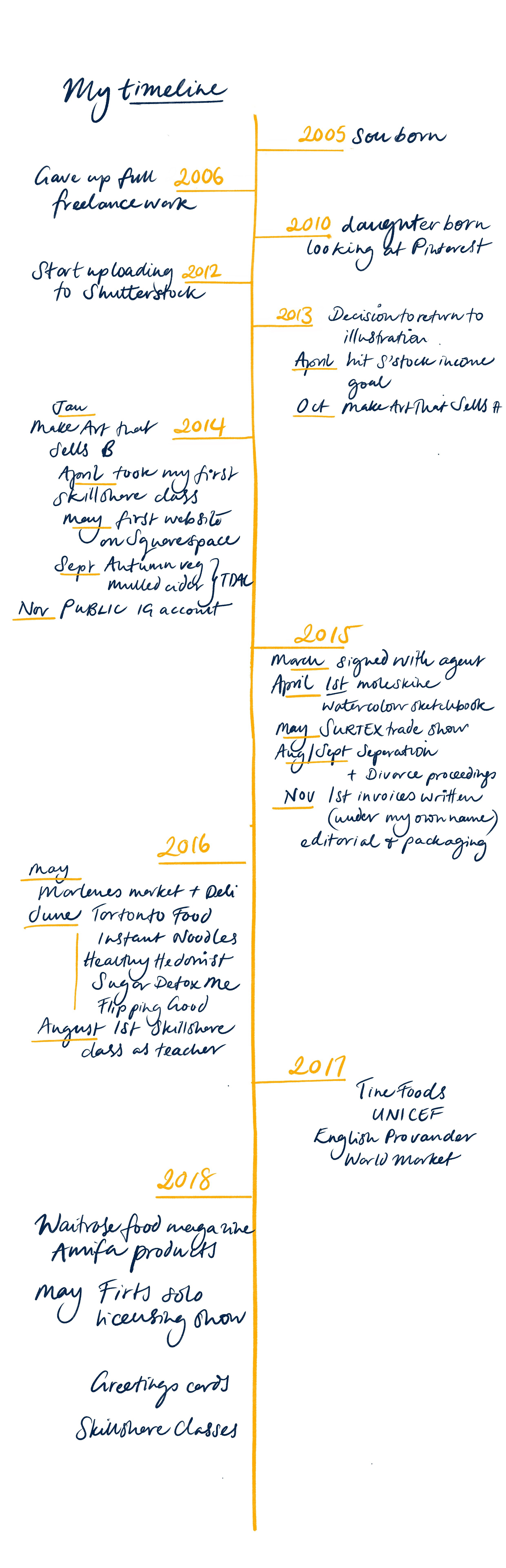
In retrospect I can draw this central line running down the middle, and the timeline looks incredibly neat and tidy with the major events for five years from 2013 till 2018… but the real experience was anything but linear, or smooth sailing.
I entered college for a degree in Advertising and Design, but I switched to Illustration in the second year. After I graduated in 1996, I was an in-house artist at several London-based greeting card companies (including Hallmark) which I really enjoyed. I was also making a good income from editorial illustration for lifestyle and health and beauty magazines. The editorial niche was something I fell into by accident because I could draw people, but after a while I really started to resent the idealized forms I was expected to portray.
2006
I gave up creative work, a year after my son was born. And then in 2010 I had another baby. That was the year Pinterest was launched—remember that, as I’m going to talk about it later.
2012
This year I started to upload old freelance art and icons to a Shutterstock image library and those became the seeds of my passive income. You can read more about passive income in this blog post.
2013
My daughter became eligible for free nursery sessions, which I factored in when making the decision to step back into illustration. That autumn I took my first intensive 5-week online course called Make Art That Sells, which really set the ball rolling.
2014
I began taking Skillshare classes to improve my skills and techniques. I created projects for hand lettering and improving my Photoshop skills.

This was followed by my first small but functional website.
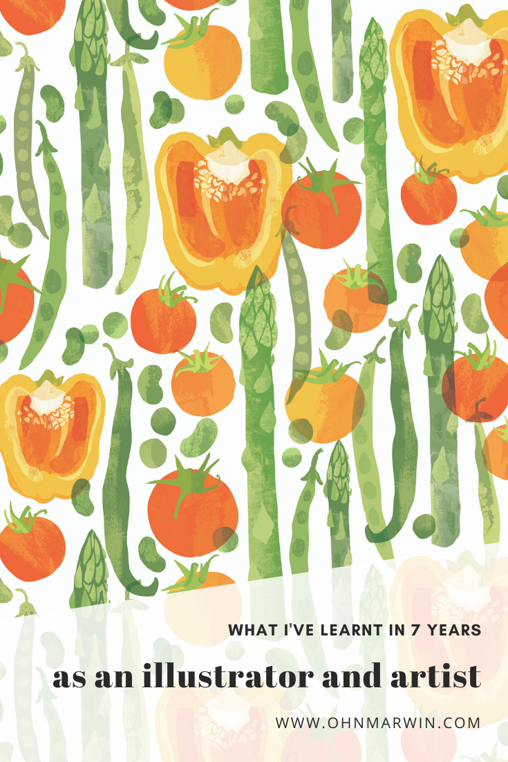
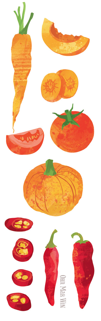
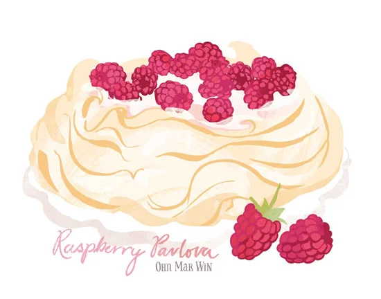
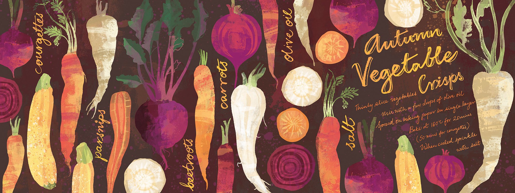
My love affair with They Draw and Cook (now called They Draw) and illustrated recipes started that year. Little did I know how unbelievably pivotal these projects would be in my career as I built up a niche illustration portfolio in my quest to become an in demand food illustrator. I used Pinterest to strategically share my art on this platform as I’d heard art directors and commissioning editors searched for illustrators extensively here.

2015
February I bought my first moleskine sketchbook for watercolor practice.
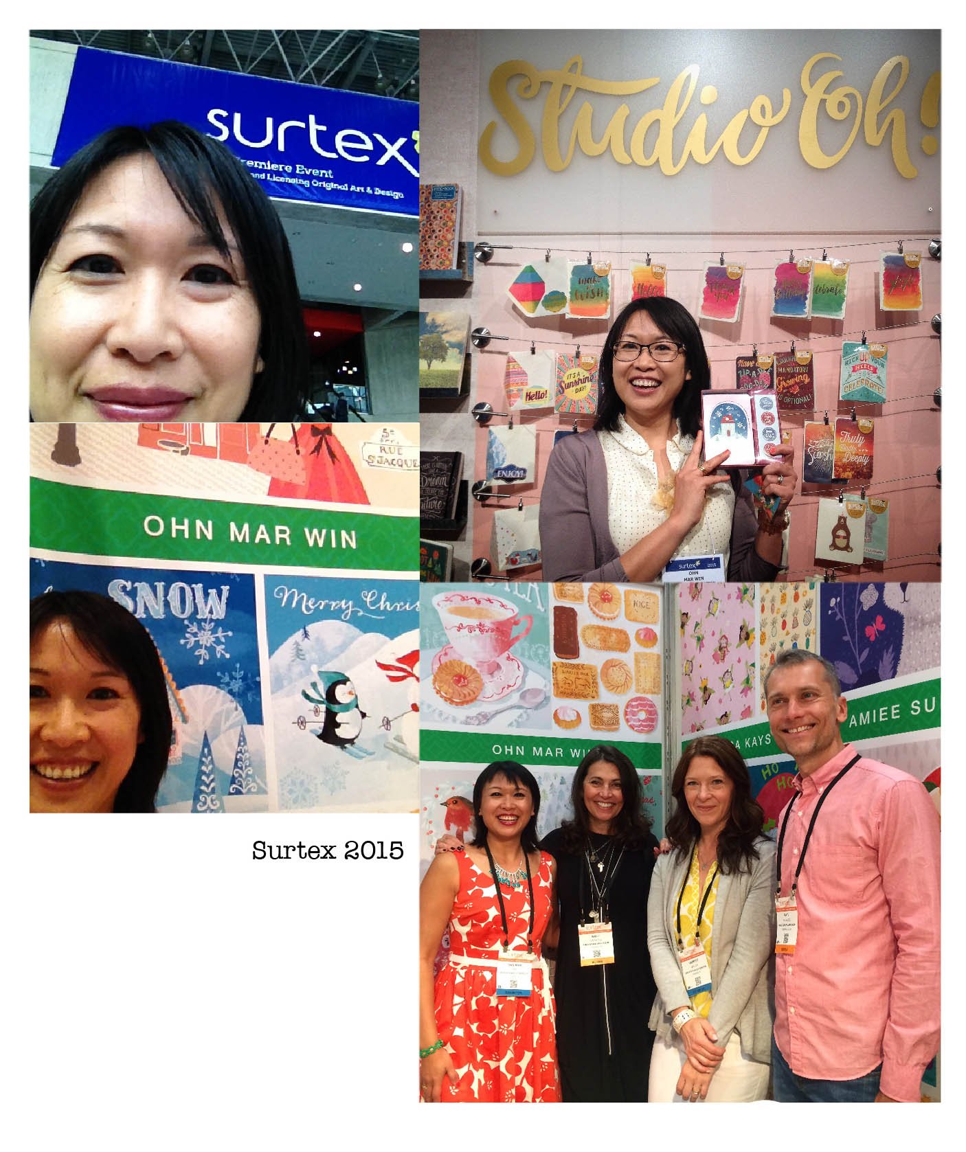
March I signed on with an art licensing agent.
May I had my art at the Surtex trade show in New York.
August breakdown of my marriage, and divorce proceedings. That was a hard time both personally and professionally.
November I wrote my first invoices under my own name for several editorial and packaging clients.
Let's pause here, as I want to point out that it took just over two years from taking that initial online course to receiving payments for my illustration services. I’ve been told this is an incredibly fast transition to go from stay at home mum to earning an income from commissioned illustration projects. The combined total for that first year of trading from stock images and food illustration was £14,000—not really enough to live on as a single parent with two small kids. However, the next three years saw an increase in large illustration projects that brought me up to a more decent income.
2016
Food branding projects:
- Marlene’s Market and Deli in Tacoma
- Toronto Market Company pop-up event


August of 2016
My very first Skillshare class as a teacher: Create Your Own Fruity Illustrated Recipe, followed by four more classes that year.

2017
More food brand packaging for Tine Foods (Norway & Denmark)

And my jaw hit the floor when a project to work with UNICEF in Myanmar came through.

2018
May
I exhibited at my first solo art licensing trade show in New York.

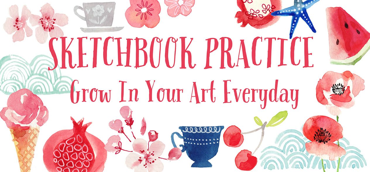
I was up to teaching 19 Skillshare classes, including two that remain among my most popular:
Sketchbook Practice: Grow In Your Art Everyday
Instagram Success For Artists: 2 Week Challenge To Grow Your Following

I haven’t included everything from these years, like the endless classes I took, the books I read, the sketchbooks I filled… If I included all that, this post would be three times as long. These are the big highlights. I hope that by sharing some of the specifics of my personal journey, it may help you understand the length of time it took to establish myself as a successful artist and illustrator.
It would be nice if we had infinite time to pursue our dreams, but most of us are working within very real constraints. Mine were navigating a divorce and becoming a single parent, whilst holding down a mortgage.
Building an art business certainly requires a heck of a lot of patience when you’re starting out and you’re coming to terms with the multitude of directions you’re being pulled in. If you are prepared with patience, it gives you room to stay motivated over a long period of time.
Although social media has been an asset in building my brand awareness over the years. I do feel it sometimes warps our perceptions on many levels. Some folks may underestimate the duration of time it takes to build a commercial portfolio that attracts paying clients. As you can see it took many years for me to see real and tangible results, like attracting a considerable following on Instagram or creating more than twenty-five Skillshare classes.
Becoming an illustrator will most likely take up a massive chunk of your time and energy as you travel from where you are now, to a point when you are comfortably supporting yourself with income from your art. Rather than feeling deflated by the prospect of having to work diligently for several more years, I hope you view my story as inspiration for what's possible with a vision, determination and strong values to guide you.
If you’re interested in making the leap into illustration, or you’d like to know more about my art journey, consider a 1-month free trial to watch all my Skillshare classes including my Transition into Illustration class. Use the button below to sign up (new members only).