
As a online and in person teacher at watercolour workshops, one aspect I cannot emphasise enough is the need for patience, for pause to let things settle. So in the context of watercolours, letting a wash dry just for a while to help with blending, or dry completely to add another layer for depth and contrast. I have seen how a lack of patience can ruin a drawing or painting, either through over eagerness, wanting a perfect piece or simply wanting to finish quicker. If you’re wanting to be a professional illustrator or designer patience is vital, as its a very tough industry to break into. It takes time to develop a art career and all it entails, you cannot possibly be expected to do everything at once (from social media to copyright worries) I’d like to stress again its a LONG HAUL path (from my own experience) so practicing patience on may levels and settings is a very important trait for all artists, designer and illustrators to consider.
If you are just starting out I know this is difficult to hear. Trust me - I WAS A BEGINNER TOO & I WAS IMPATIENT TOO. I wanted to learn all these things :
- Find a style
- Build my portfolio
- Learn about technical repeats
- Learn watercolour…… AS QUICK AS POSSIBLE and find the possible shortcuts
I do feel in these fast paced times it’s SO ridiculously easy to see what other artists and illustrators are up. Then we look at where we are, compared to where we want to be, and that gap seems pretty intimidating. Now factor in society’s obsession with instant gratification, convenience and the frustration builds further. However building up your skills, making art you care about, and finding an audience that adores what you create, takes a good amount of daily effort; that is a simple fact.
This is where patience comes in - in the context of a creative pursuit or career in general it means maintaining our enthusiasm and drive when pursuing our goals, however long that takes. Following through on the promises you made yourself takes some confidence, and will never be a linear process but its one we have to navigate.
4 Reasons to Cultivate Patience
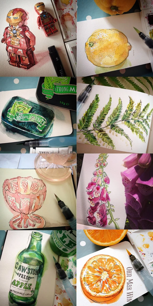
1. Your Art will take time to perfect
Accept that what you paint, draw or illustrate won’t be perfect, the first time or the third or even the tenth. But there is no way around it. Taking the time to work on a sketch can become frustrating at times. Redrawing and perhaps redrawing again, and again, over and over is a pessary requirement for me even these days. Those frustrated feeling could become anxiety, along with that fear of it not turning out as we hoped. I know it sounds tough - the notion that what you create will be flawed and imperfect for quite some time but we have to walk past the uneasy feelings and climb up to the comfortable places where we’re happy with our creations.
2.Trusting the process
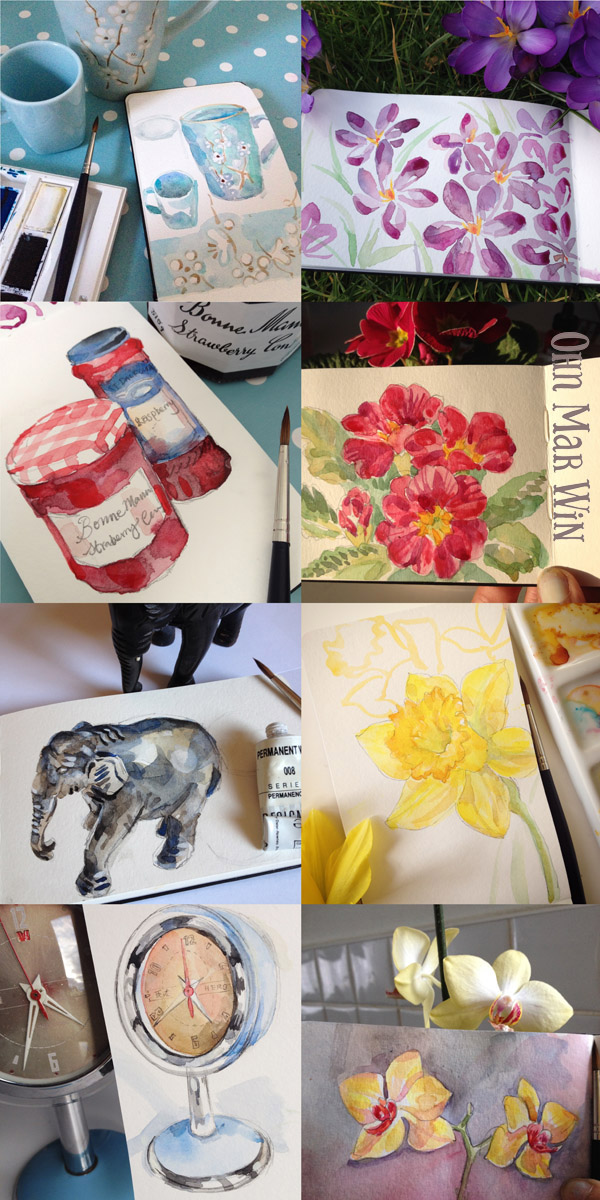
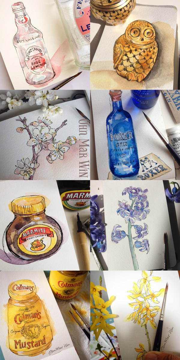
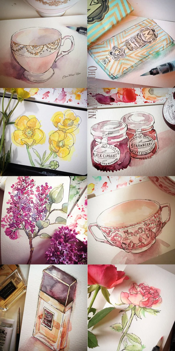
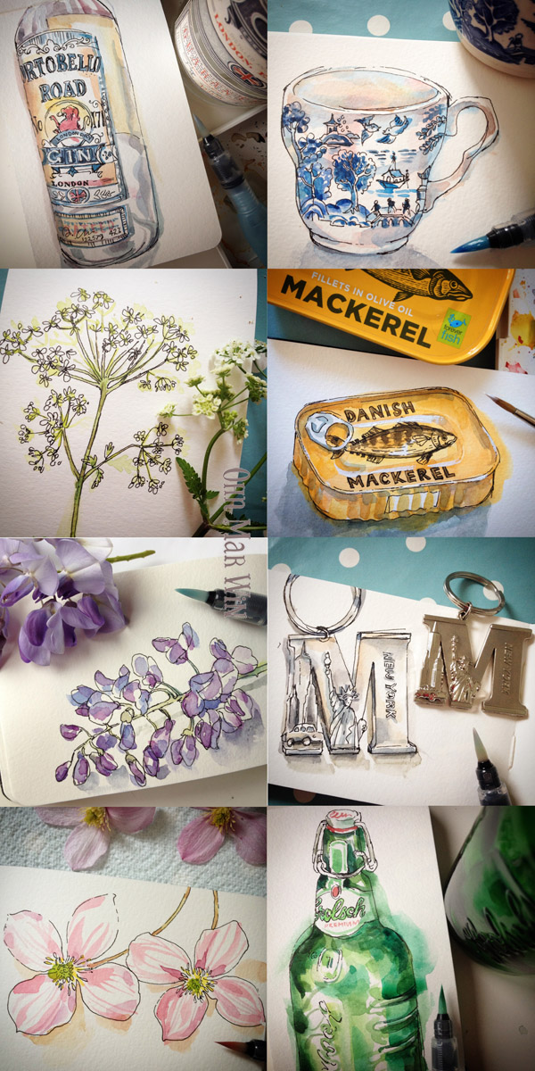
As mentioned repetition is essential to improving your drawing, finding that style, refining techniques and getting to know PS etc. For example, If you do one sketch a day (like I did) then you will look back in a year and see progress. That’s a solid, reliable truth you can base further explorations on. Trusting this process helps me to be patient with the fact that some of my creative gaols might take years to come to fruition. Its very much a case trying to find joy in the process itself than reaching that finish line. And I am by no means a finished article either.
3 Acceptance of Discomfort
I’m hoping that you have come to realise and understand that emotional discomfort is a part of overcoming many creative challenges. There is no way to circumnavigate these feelings (those that say you maybe flawed….try to turn down that chatter), so I’ve found its best to accept these challenges as different ways of learning, and are actually a natural part of evolving as an designer or artist. So there is nothing for it but rolling up our sleeves and do the work we need to do even if its difficult.
4 Sustaining in the real world
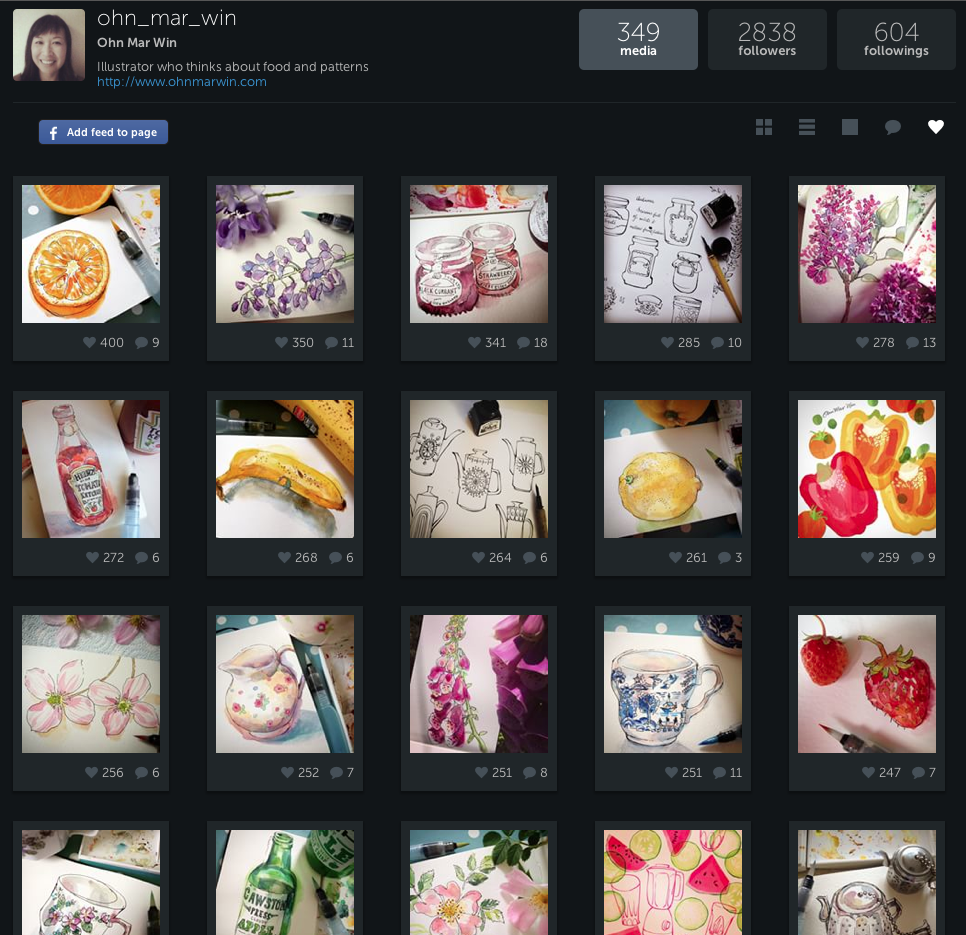
Often it can take many months or even years to see the finished results, eg building up a social media following or exhibiting at an art licensing show. Or perhaps you submitted designs to manufacturers or agents and you have to wait for them to make a decision, which again could take many months. At the end of which there could be a ’no thank you’, and thats not just once, that could be dozen times or more, before you finally hear a ‘Yes’ (and then another term before before you could see the money) Most artists begin a large project with a burst of enthusiasm and they are eager, but soon it seems that this creative project is taking forever or not not turning out as we hoped. This has happened to me many times and as a professional I have to follow through, having to be patient with the client and myself.
The art and design industry is tough, I’ve been delving in and out of it for 23 years and it hasn’t gotten any easier. However my attitude to it has shifted considerably. It certainly requires a heck of a lot of patience when you’re starting out and you’re coming to terms with a multitude of directions you’re being pulled in. If you are prepared with patience it gives you room to stay motivated and tolerant of all the delays. And it can actually improve our capacity to deal with rejection emails, no traction on social media or a if a book proposal is turned down etc. We just have to assure ourselves that the good stuff is just around the corner.
Don't give up no matter how many times you have tried and failed. And let me assure you its happened to me more times than I care to remember. The next time you try, could be the right time. Your efforts and patience will lead you to fulfilment along with more courage, strength and optimism.